Ulti-Store Self Storage0%
ALL PROJECTS
BRANDING
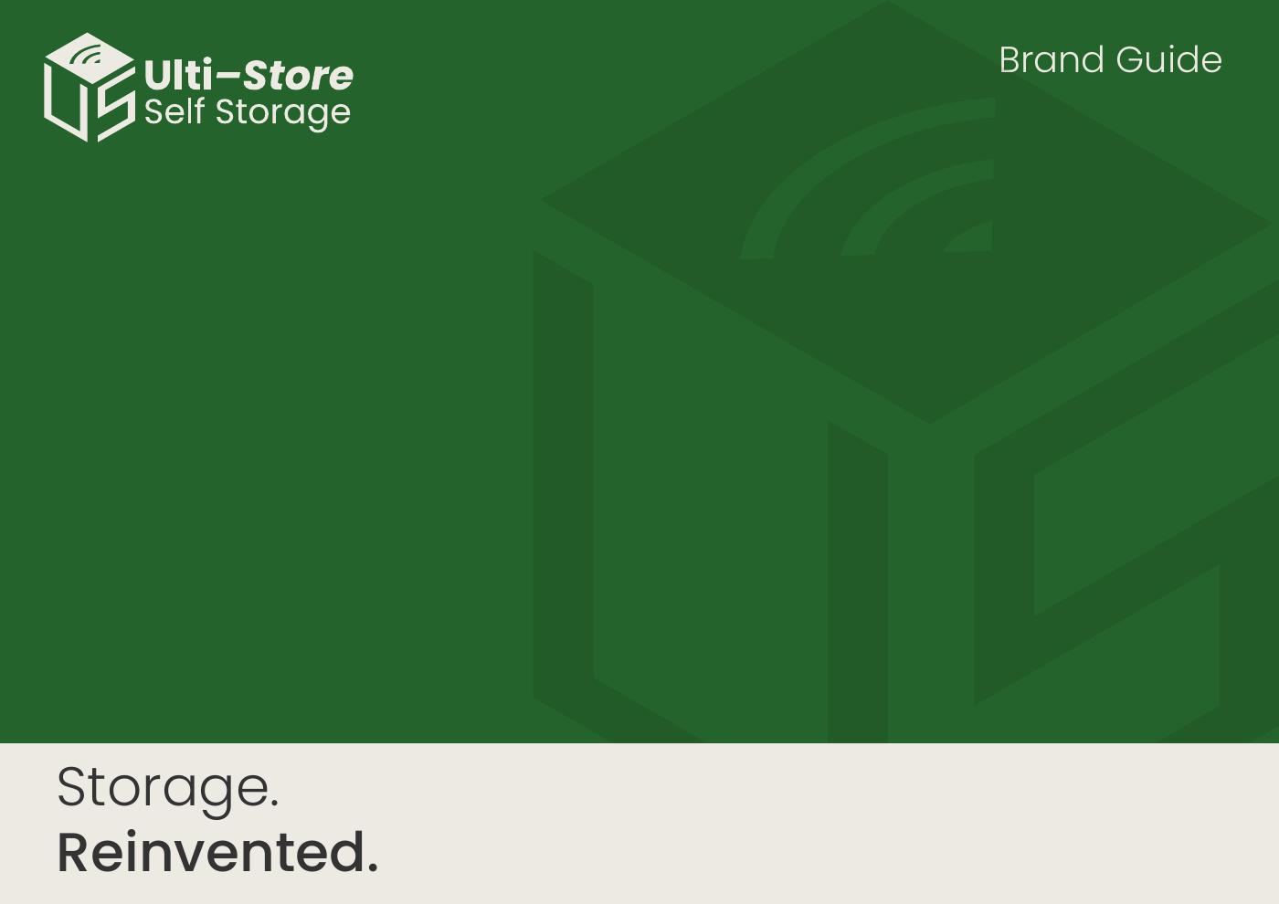
Ulti-Store Self Storage
A bold, geometric identity for a self-storage brand.
- CLIENT
- Ulti-Store Self Storage
- YEAR
- 2025
- ROLE
- Identity design, brand guidelines
THE PROBLEM
What we were solving.
Self-storage is a commodity category — Ulti-Store needed a mark that felt secure, modern and instantly recognisable on signage from the road.
THE SOLUTION
How we approached it.
An isometric cube monogram that reads as both a storage unit and the letters U and S, paired with a confident sans-serif wordmark and a deep-green palette, documented in a full brand guide.
GALLERY
A closer look.
Tap any image to view it full screen.
TECH STACK
What we built with.
- Logo design
- Brand identity
- Signage
- Brand guidelines
OUTCOME
The impact.
A distinctive mark that scales cleanly from a signage board to an app icon.